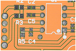
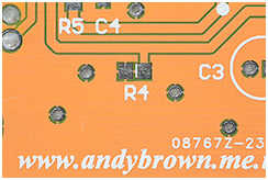
PCB soldermask colours: which one should you choose?
I’m sure that all electronics hobbyists have, by now, noticed that anyone can get their PCBs printed at the online Chinese services such as Seeed Studio, ITead Studio and Elecrow. Many of you will have even used those services. I have, and I’ve used them often.
Introduction
When selecting the parameters for your printed boards one of the options that you get is a choice of colours for the soldermask.
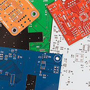
Along with the traditional green there are others such as red, blue, yellow, white and black available and sometimes at no extra cost. But which one should you choose? Are there any advantages or drawbacks to choosing something other than the standard green? That’s the question I hope to answer in this short summary of my experience.
Since I’ve now had multiple boards printed using every soldermask colour available I’ll go through each one with a short overview of the good and the bad.
Green
Click on any of the three images for a very large version
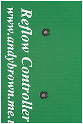
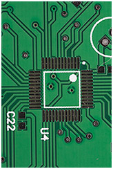
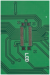
Bog-standard green with white silkscreen. Boring eh? Maybe so but green is probably the best of all the available colours in practical terms. The contrast between traces, planes and vacant space is high so you can inspect your boards easily with the naked eye to check for manufacturing defects. The white silkscreen contrasts well with the soldermask and flux residue cleans up well leaving a professional looking board.
Don’t be so quick to dismiss green as your choice of colour because if your board routing is a work of art then green might just be the best colour to show it off.
Red
Click on any of the two images for a very large version
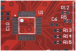
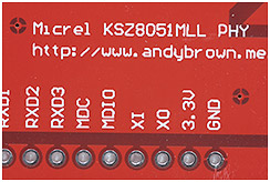
I like red, it’s bold and it looks professional. The contrast between traces, planes and empty space is good, but noticeably lower than on a green board. Inspection of fine traces on the board for defects is best done with some form of magnification. Silkscreen stands out well against the red background and flux residues clean up well, just as well as on a green board.
Red can look bold and eye-catching, though not exactly unique since everyone’s doing it these days. If you want your beautiful routing to be the star of the show then green is still the best bet.
Blue
Click on any of the three images for a very large version
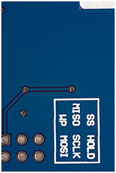
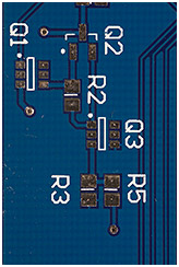
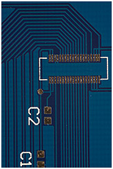
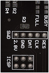
It’s a dark blue, the same as the one used on the Arduino. The contrast between traces, planes and empty space is quite low now and magnification is mandatory to inspect for manufacturing defects. On the plus side contrast between silkscreen and soldermask is very high so if your board is label-heavy then blue might be for you.
I also find that the combination of black integrated circuits, black pin headers and silver coloured connectors is aesthetically pleasing and looks very professional. This is also a good colour for mounting an LCD against as your eye is not drawn away from the screen by bright background colours and sharply contrasting edges.
Blue doesn’t clean up as well as red and green. As a dark colour it is prone to showing off dirt and if you’re not careful then flux stains can be stubborn to remove.
Blue can be a good choice if you’re not bothered about showing off the traces on your board or you need to match colours with your Arduino shield design against an Arduino host.
Black
Go on, click on them…
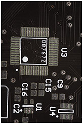
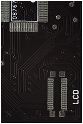
I don’t know what it is about gloss black that makes me keep coming back and choosing it? The contrast between traces, planes and empty space is virtually non-existent. Inspection of the board not only requires powerful magnification but you also have to angle a light just so it casts a shadow where the traces raise slightly above the board. A total nightmare to inspect.
At least the silkscreen contrasts well; in fact the silkscreen and the pads are pretty much all you can see on the board without optics and lighting to help you. At the time of writing only gloss black is available. The extremely cool matte black is yet to become available at the prototyping services.
Another peril with black is the way that it absorbs heat during reflow. You have to either scale down your profile or make sure that your temperature sensor is actually placed on the board itself. The silkscreen is also prone to turning light brown during reflow, presumably because the board under it takes on so much heat.
Cleaning is very hard indeed. It’s not that the flux stains are harder to remove; it’s that if you tilt the board to the light to see your routing then you also see where all the stains were!
On the positive side, and probably the reason why I keep coming back to black is that it really is the best colour for mounting an LCD against. Nobody’s going to be looking past your screen at distracting details when the backing colour is black.
Black’s a tough one to love and you really have to want it to ignore all the drawbacks. I’d like to say that I’ve scratched my black soldermask itch but it does look so good as a screen background.
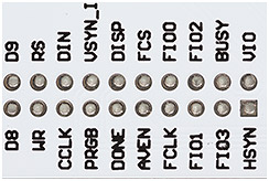
White
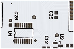
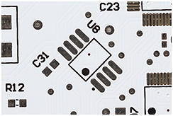
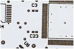
You can see ’em bigger, but they don’t get any clearer
OK I’ll get right out and say it; you’ve got to be crazy to want the gloss white soldermask option. There’s really nothing at all good about it. My excuse is that I knew this board was never going to be the final version so I thought I’d select white just so I could see it, knowing full well that I’d be complaining about it later.
If you think that the black soldermask makes your routing hard to inspect then you haven’t seen white. Contrast is the lowest of all the soldermask colours and even tilting to the light fails to properly show the traces. My microscope has a 45° stage light and even under that the traces are almost invisible.
Cleaning is just as tough as you’d expect. If you can get all the residue off then the board can look quite nice but it’s white so you really have to get every spot off for it to look good.
I find that the overall look of a built board is quite strange. Because the traces are invisible your components look like they’re floating on a sea of white. It’s just not right. Perhaps if your board is so dense that the component area outweighs the white area then you might pull it off. I remain to be convinced.
On the plus side the black silkscreen contrasts just as well as you’d expect black on white to do so any artwork you’ve got in the silkscreen layer will stand out very well.
The BeagleBone is probably the best known professional product with a white PCB out there and while I don’t think it looks terrible I do think it would have looked better in a different colour; maybe blue would have looked best with all that black and silver on there to set it off nicely.
Yellow
Click on any of the two images for a very large version
Why does no-one choose yellow? It’s not bad at all really. OK yes, it’s a bit of a murky shade of yellow and I’ve tried to adjust the photograph colours to correctly show it but unless your monitor is calibrated like mine is then it’s not going to show correctly I’m afraid. Take my word for it, it’s sort of murky and desaturated.
The contrast between planes, traces and spaces is very high. In fact it’s just as high as green so if you’ve got some beautiful routing to show off (and your PCB should be a work of art) then murky yellow may be the right choice for you.
About the only downside is that the white silkscreen does not contrast well with the board. Not so bad if you’re not producing something with lots of user instructions in the labels or you don’t go for fancy artwork in the silkscreen layer. I’d like to see an option for black silkscreen with this soldermask, I think it would work better for many designs.
I’ve found that yellow is a breeze to clean, no more difficult than green or red and any light residues that remain don’t stand out.
In summary I’m surprised that yellow isn’t an option chosen by more people. I may be unfairly maligning it by referring to it as ‘murky’. Perhaps ‘dark’ yellow is more appropriate.
Others I haven’t tried
Some services, e.g. OSH-Park offer a nice looking purple soldermask that matches their gold ENIG pad finish very well. I’ve never tried this but others speak well of it.
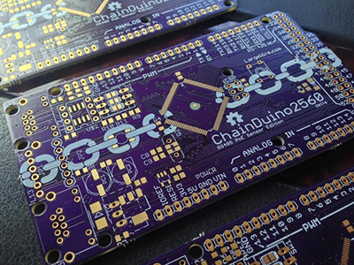
Image from Kickstarter project page
Other, more exotic finishes such as matte-black and matte-green aren’t available through the cheapest sources just yet but can be found at medium to high-cost houses such as PCBCart and PCBUniverse.
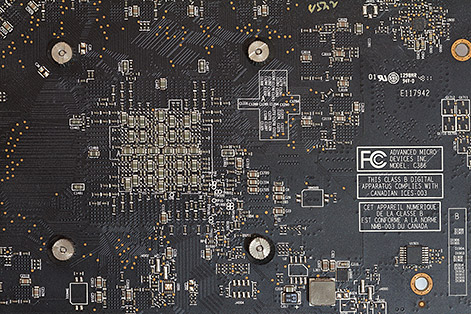
How the pro’s do it: the XFX 7970 graphics card (click for larger)
My XFX 7970 graphics card (bottom layer pictured above) is matte black and it looks very cool indeed, despite having all the trace visibility issues that gloss black has. Do you think the C3129 silkscreen label means that there really is 3000+ caps on that card or are they encoding more information in the label than just a sequential counter?
The end
There aren’t many resources out there to help you selecting a soldermask colour so I hope that this somewhat opinionated view of the available options goes some way to helping you make a decision.
Do you agree, disagree and have you got some photos of some of your boards in these soldermask colours that you want to share? Please feel free to drop in at the forum or leave a comment below.

